
I scroll through my own product, tracing its animations and micro-interactions like a fingerprint. I built these transitions to delight, but do they delight, or distract? With each added layer of polish, I wonder: what’s the real cost of this polish? What toll does it take on our collective attention, on the few spare minutes we still call our own, and on the energy quietly drained from the planet with each flicker and refresh?
A month or so ago, I was researching the impact AI is having on our planet and it reminded me of a time a while back when I decided I would try and calculate our feature set’s digital carbon footprint. I can’t remember the destila exactly, the numbers weren’t enormous on their own, a few extra kilobytes here, a handful of server calls there. But multiplied across millions of sessions, they began to look like real emissions. When did we start treating every click as free? When did convenience become more important than consequence?
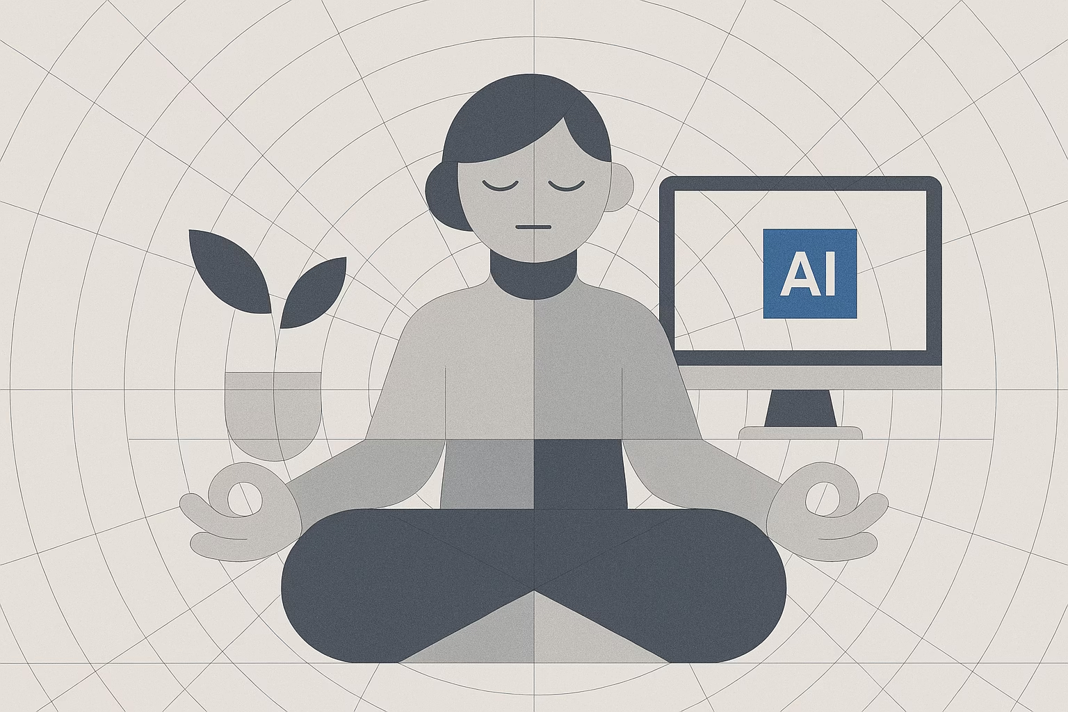
Perhaps the harder question is this: how much responsibility does a product designer bear for invisible energy drains? We pride ourselves on lean code and modular systems, yet we rarely pause to consider the hidden toll of continuous background processes, endless data replication, or a home screen that refreshes itself every second. Could fewer auto-refresh cycles actually deepen a user’s focus? Do we need that parallax scroll, or does it simply fuel another dopamine spike?
There’s a quiet rebellion stirring in me against interfaces that shout for attention. I find myself craving pauses, tiny digital breaths where nothing moves, no badge blinks, and no push notifications. In nature, our senses calibrate themselves. From a breeze over my wrist, the rustle of leaves, even the sounds of a birds wingbeat. Why can’t our screens honor the same principle of emotional reprieve? What if subtle, biophilic textures could soothe rather than startle?
Emotional design isn’t about adding flourishes; it’s about removing friction. It’s less about “wow” moments and more about “ah” moments, where users feel held, not hustled. Where does that leave our obsession with maximalist visuals and hyper-dynamic feedback loops? Are we enriching the experience, or are we gilding a cage?
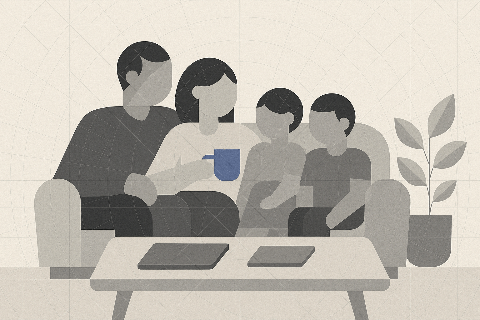
Time is perhaps our most precious resource. It’s far more finite than storage space or CPU cycles. My calendar plugin taught me that deliberate constraints can liberate us. By carving out evening sanctuaries, non-negotiable blocks of family dinner, bedtime stories, and unhurried conversation, I have reclaimed more presence than any productivity hack ever delivered. Could our products help users carve out those sanctuaries instead of eroding them?
Imagine an inbox that honors your schedule, deferring non-urgent messages until your chosen focus hours. Or a reading app that gently nudges you when it’s time to step outside and feel the sun. Would innovation suffer if we built features around rest instead of relentless reach? Might we even discover a new form of creativity born from calm?
I don’t have the answers. I don’t even know if the path forward lies in new design patterns or in rediscovering ancient ones. But I’m certain of this: the next frontier for product designers isn’t more hooks or deeper engagement metrics. It’s the quiet art of subtraction. The ethical imperative to measure our outputs in more dimensions than dollars and downloads. The emotional promise to hold space for users’ wellbeing. The environmental responsibility to tread lightly on a world already strained by digital excess.
So here’s my invitation to other designers, to product teams and to anyone who’s ever tapped “like” with a restless thumb: let’s ask ourselves tougher questions, and let uncertainty be our guide. What if our most meaningful innovations are the ones that help us do less, feel more, and live with a little more room to breathe?
Extraction, Not Engagement
I built a pull-to-refresh, something that now feels like a ritual. A subtle reward loop every time a user drags down their feed. It pings up “Fetching your unread updates,” but really it should say “Trying to hook you in.” Because that’s exactly what it does. It tugs on your curiosity until you can’t look away. I believed I was delighting users, but was I really just training their brains to crave small jolts of novelty? And at what cost? Their time, focus, their family dinner conversation?
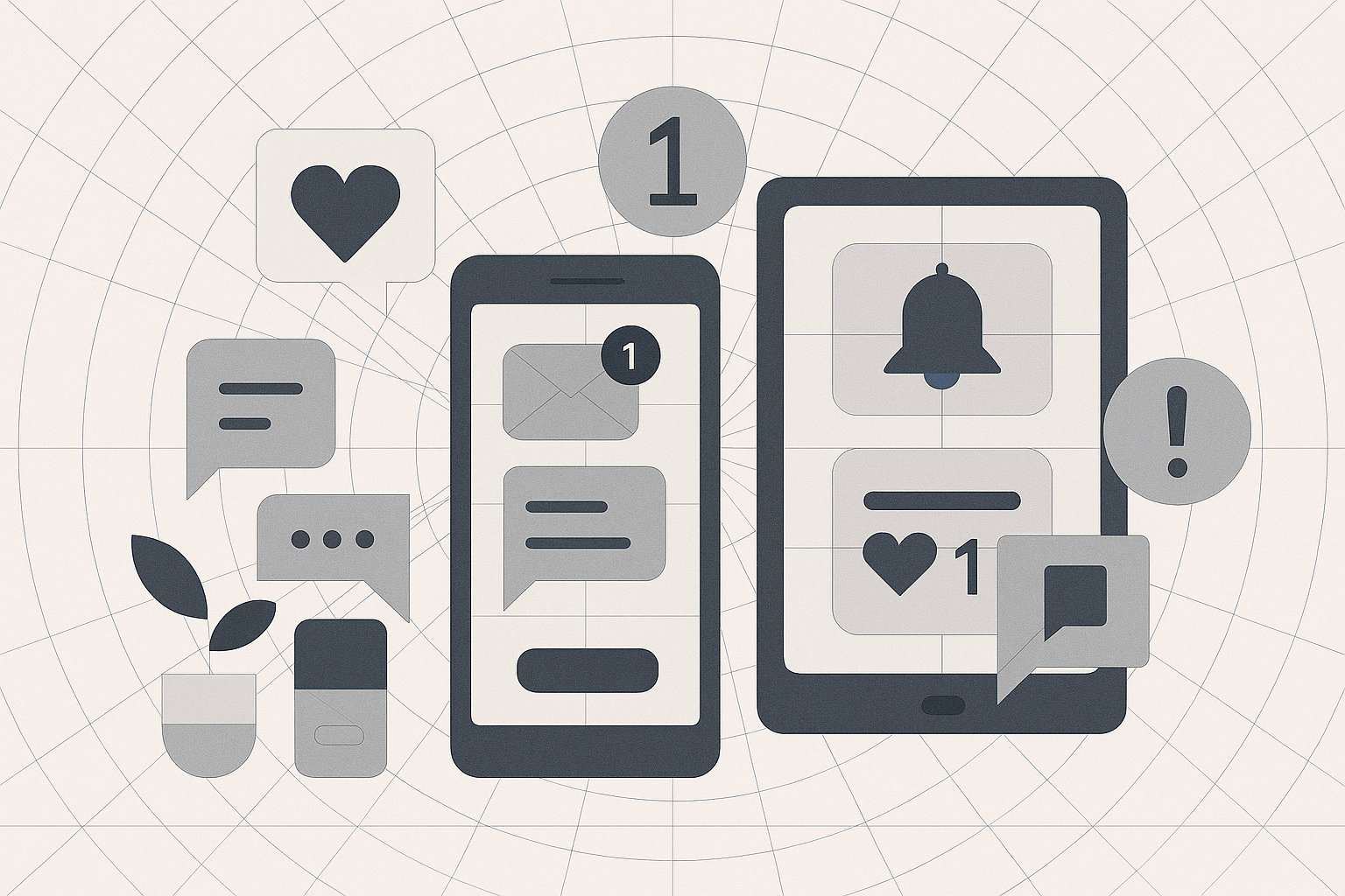
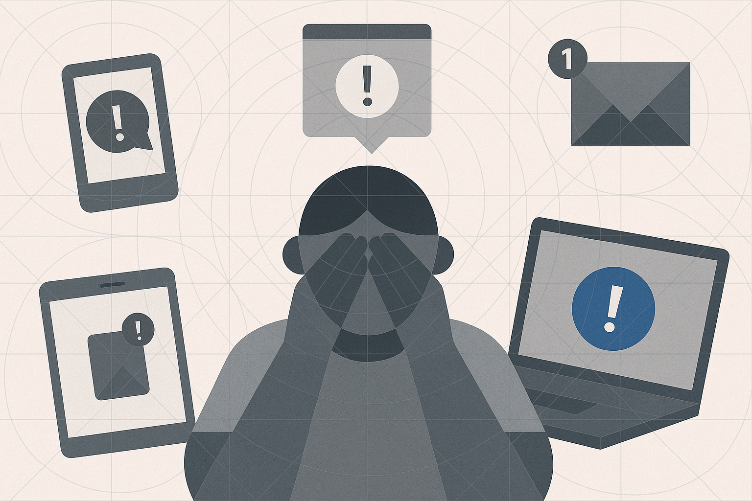
We talk about engagement as if it’s an unalloyed good. Higher click-through rates, longer sessions, more shares are all metrics gleefully chased. But do these numbers mask a deeper extraction of our users’ most irreplaceable resource: attention. Every animation, badge, and red dot is a tiny claim on someone’s mental real estate.
Are we trading meaningful interactions for fleeting dopamine spikes? Do we conflate connection with compulsion when we layer infinite scroll on top of social feeds? When did our design ethos shift from “How can we help people live better?” to “How can we get people to stay longer?”
These aren’t rhetorical quips. They’re moral signposts. Because in the race for retention, we risk turning our products into psychic leeches, siphoning away headspace that might otherwise be spent on bedtime stories, or simply watching a child master their first bike ride.
I crafted a tiny banner that reads “Leaving so soon? See what’s new.” An innocent nudge, right? Beneath its veneer of helpfulness lies a whisper of “You’ll regret it if you go.” That’s FOMO weaponized through two dozen characters. Microcopy has become a scalpel for emotion. It can inspire joy, or it can seed anxiety.
How often do we disguise anxiety as urgency? A “Maybe later” prompt that quietly stirs panic. An onboarding line like “Stay ahead of the curve” that plants doubt the moment we hesitate. We call it friction, resistance, hesitation—but maybe it’s just someone needing a breath. A pause. A moment to choose presence over pressure.
Microcopy is the poetry of persuasion, and we’ve weaponized it. It’s time to ask if small doses of honesty, such as “No pressure, we’ll be here when you return,” can replace the nails-on-chalkboard urgency of “Upgrade now or lose access.”
Energy Drain
Have you ever shaved 20 KB off an image? It feels like a mini victory! But then I realise that saving tens of kilobytes per load still translates into megawatt-hours when multiplied by millions of sessions. Our apps wake from sleep dozens of times a day, refreshing data, pinging servers, spinning up CPUs. The carbon footprint isn’t just a server farm problem, it’s a problem that lives in every pocket, every home battery and every network node.
Imagine if every interface we shipped carried a quiet label: “This page costs 0.03 grams of CO₂ to load.” Not as guilt, but as awareness. What would change if lazy loading, static placeholders, and energy-aware themes weren’t edge-case optimizations, but baseline standards? We measure clicks, conversions, retention, but we rarely measure the kilowatt hours behind them. What if we treated energy impact with the same urgency as performance? Maybe then, our features would serve not just users, but the planet too.
Designers rarely see these metrics in real time. Yet our decisions ripple through energy grids and climate forecasts. If we can prototype a dark mode, can’t we prototype a “low-carbon mode” that trims nonessential assets and nudges users toward offline moments?
Wellbeing
My phone lights up. It’s during my son’s bedtime. Another Slack notification and a tweet from someone I can barely remember. Then a game prompt I just can’t resist from opening up. In the glow of that screen, I lose the cadence of my son’s breathing, the subtle rise and fall of family rhythms. We’ve built tools that have meant to connect us, yet they have fractured our presence into tiny, anxious fragments.
Somewhere along the way, “always on” became the baseline for how we relate. Notifications stopped serving us and started staking claims on our attention. What if our products respected focus time, silencing the noise, leaving only what truly matters?
I think about digital breaks. Like calendar plugins that block all pings after 7 pm, interfaces that dim and fade away when it’s time to close the laptop. Real rest isn’t toggling airplane mode; it’s knowing the product has your boundaries baked in, so you don’t have to wrestle them into place every evening.
Building in the Balance
I’m split between retention metrics and human wellbeing. As product designers, innovation is our lifeblood. We chase novelty and performance. But innovation need not come at the expense of emotional or environmental wellbeing. It can arise from constraints as much as from unleashing every possible feature.
What if our next A/B test didn’t just chase clicks, but asked whether users felt calmer afterward? Imagine measuring success by offline streaks or evening peace, not just engagement spikes. What if every prototype carried a quiet metric: wellbeing impact, right alongside load time and conversion rate? Maybe then, we’d design not just for performance, but for presence.
A balanced interface doesn’t strip away ambition, it simply redirects it. Low-impact animations that delight without draining. Microcopy that invites without instilling guilt. Notification systems that align with human circadian rhythms. These are not trade-offs, they are the frontier of product innovation that honors everyone involved, the users, the designers, and the planet itself.
In the spaces between these questions lies our challenge, and our opportunity. We can keep chasing sessions-per-user, or we can redefine success as sessions well spent. We can pile on every engagement hack, or we can uncover engagement hacks that engage mindfully. We can ignore the weight of our code, or we can measure it, name it, and lighten it.
Pause.
Breathe.
Let the uncertainty guide us toward more humane, ecological, and thoughtful design.
When you’re next designing, and wondering if that little “Hurry up, only one seat left!” banner is going to be enough to nudge someone toward a sale, stop. Are you actuallu just nudging the user towards anxiety?
Have you ever heard of the Ethical Design Guide? It’s a collection of checklists and mapping exercises that help you uncover hidden biases or manipulative nudges in your words and screens. Imagine swapping “Don’t miss out” for something as simple as “Take your time, we’ll be here,” just to see if a sprinkle of honesty can replace that tickle of FOMO. If you like the sound of that, maybe you should check out dscout’s To Prevent Harm framework, which walks you through real-world scenarios to spot edge cases you’d never thought to question.
But all this goes beyound just ethical reasoning. What about the environmental? When you next fire up Chrome’s DevTools, check out the Lighthouse energy audit, and watch how it flags every heavy script, every auto-playing animation, and every image that loads before you scroll. It translates page weight and CPU cycles into energy use so tangible you can almost feel the watts draining away. Now think about how Google keeps its search page nearly blank, or how Ecosia ties searches to tree-planting. Both lean on deliberate choices that nudge users toward low-impact habits without sacrificing speed or utility.
None of these tools or products ask you to sacrifice innovation. They simply invite you to ask different questions. What if a moment of friction became a moment of reflection? What if every feature carried a gentle reminder of its human and environmental cost? Why no run an ethical checklist on a single screen you’ve recently designed, or audit your heaviest page for energy waste? Because every line of code you write ripples out to screens and lives you’ll never see. And sometimes, the most powerful innovation is the space you leave open for life to happen.


